

You don’t need a safe, flat white to get a restful bedroom. Some of the calmest rooms are painted in colours you’d never expect, like deep red, mossy green, or even inky black. The right shade doesn’t shout at you. It wraps around you at the end of a long day.
That’s good news if you’ve been staring at the same beige walls for years. Whether you love soft, airy tones or want something dramatic and cocooning, there’s a colour that fits your style. Here are 14 bedroom colour ideas, each with a picture in your mind and a practical tip, so you can choose a shade you’ll love waking up to.
1. Soft Blue for an Easy, Restful Start
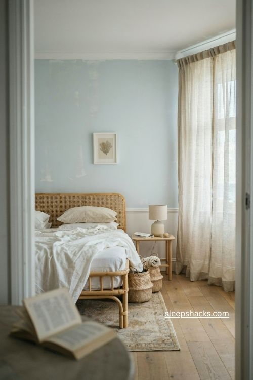
Light blue has long been tied to peace and quiet, which is why it shows up in so many coastal bedrooms. Picture a pale, watery shade on the walls with a rattan bed frame and linen bedding, and you can almost hear the waves.
It’s one of the easiest colours to live with, since it sits happily next to white trim, natural wood, and woven textures. Paint the ceiling a fresh white to keep the room bright. If you’re unsure where to begin, soft blue is a versatile choice that works with nearly any design style, and it will age well as your tastes change.
2. Sage Green for a Calm, Natural Feel
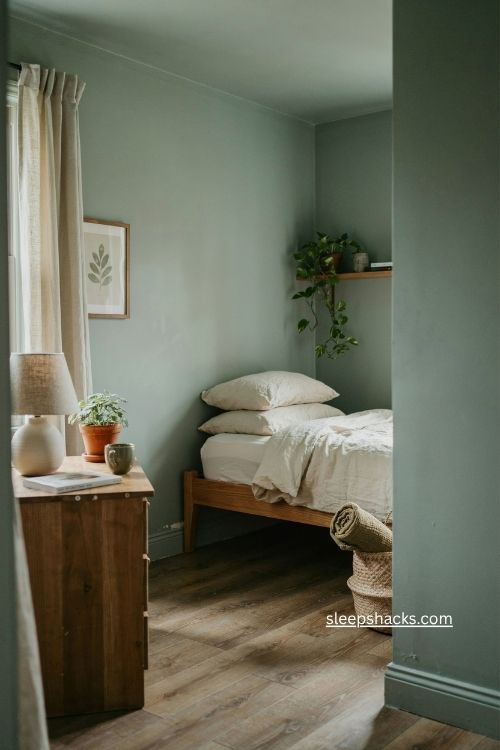
Sage green is famous for its calming effect, and it’s especially lovely in a small space. Imagine a tiny bed nook with the walls, trim, and ceiling all painted the same soft green, so the whole corner feels like a cozy hideaway.
Painting everything in one colour hides awkward lines and makes a compact room feel deliberate. Pair it with creamy bedding, a wooden nightstand, and a plant or two. Sage works well if you want a room that feels airy and natural, but not as cold as some blues can feel on a gray morning.
3. Warm Taupe for Hotel-Style Calm
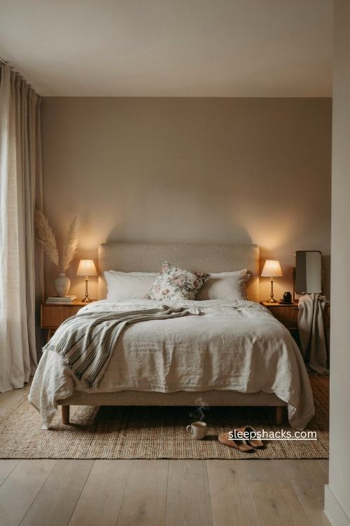
Some bedrooms feel like a luxury hotel the moment you walk in, and warm taupe is often the secret. It’s a soothing, grown-up shade that sits between gray and brown, giving walls a soft, enveloping look.
Designers often balance it with a mix of masculine and feminine patterns, like a striped throw next to a floral cushion. Layer in linen, wool, and a few brass touches to keep the room from feeling flat. Taupe is a great choice if you want serenity without committing to anything too bold, and it works well in both bright and dim rooms.
4. Creamy Beige With a Hint of Pink
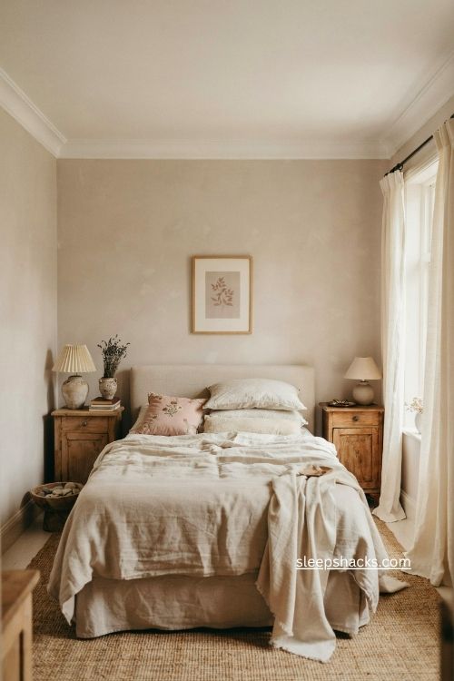
Beige gets a bad reputation, but a good one can feel glowing and soft. A mauvey beige reads slightly pink when sunlight hits it, giving the room a gentle, flattering warmth that plain white can’t match.
Try a creamy shade on both the walls and ceiling for a bright, cocoon-like effect. This kind of warm neutral is timeless and versatile, so it welcomes almost any bedding colour or art you add later. If you want to refresh the room without repainting every few years, this is a smart, low-risk option that always looks pulled together.
5. Dusty Pink That Feels Grown-Up
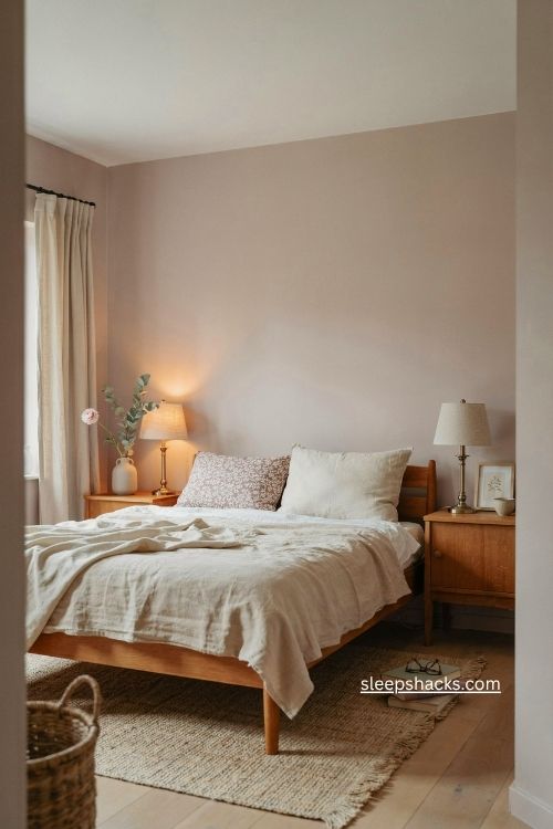
Pink walls can be pretty and energizing, but dusty pink is the muted, more neutral version. It looks bright and airy, especially when combined with a crisp white ceiling and simple furniture.
The trick is choosing a shade with a bit of gray or brown in it, so it reads as sophisticated rather than sugary. A mauvy, neutral undertone feels especially calming. Pair it with warm wood, cream linens, and brass lamps. It’s a lovely pick for a guest room, and it flatters almost everyone who walks in, which makes any visitor feel instantly welcome.
6. Burnt Orange for a Warm, Cozy Glow
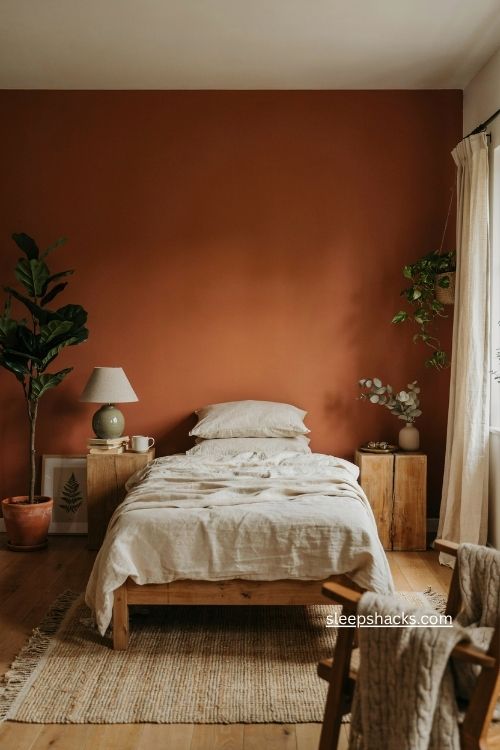
Nature-inspired shades like burnt orange, rust, and amber bring warmth straight into a room. On the walls, a deep terracotta-orange feels cozy and relaxing, yet it still has a quiet energy that makes mornings feel less groggy.
Because it’s such a strong colour, keep the rest of the room simple. Cream bedding, natural wood, and a woven rug let the walls take centre stage. If you’re nervous about going all in, try painting a single wall behind the bed first. Add a few green plants for a fresh contrast that makes the orange glow even more.
7. Butter Yellow for Sunny Mornings
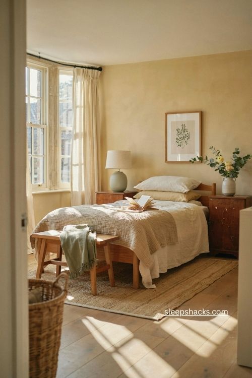
Yellow is associated with happiness, and a soft, buttery version can make a bedroom feel cheery and inviting. Think of a warm plaster-like finish that seems to catch the light, while cream and brown tones keep everything else peaceful.
Be careful not to choose a shade that’s too bright, or it can be hard to unwind at night. Butter and pale gold are the safest choices. Yellow also pairs well with almost every other colour, so you can change your bedding with the seasons. It’s a wonderful way to celebrate natural light in a room with big windows.
8. Charcoal Gray for a Moody Hideaway
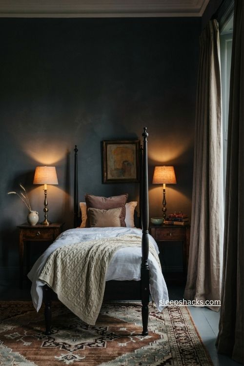
Dark gray walls feel sophisticated, moody, and wonderfully intimate. Picture a charcoal room with a black four-poster bed, and you’ll see how quickly a bedroom can become a dramatic retreat.
To keep it from feeling heavy, layer in plenty of texture, like chunky knit throws and velvet cushions, and choose warm lighting. White bedding stands out beautifully against the dark walls. If you’ve always wanted a cozy, cave-like room, charcoal is a great place to start, and it hides scuffs and shadows far better than a pale shade ever could.
9. Deep Red That Feels Romantic
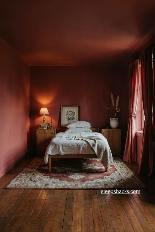
A deep, moody red might sound intense, but it can feel passionate, romantic, and surprisingly calming. Imagine walls and ceiling painted in the same wine-coloured shade, with the whole room glowing under a low lamp.
This approach, often called colour drenching, makes the space feel wrapped and private. Keep the furniture simple and let the colour do the work. Soft white bedding and warm wood balance the richness nicely. It’s a bold move, but if you love dramatic spaces and don’t mind a bit of risk, a deep red bedroom becomes a memorable, personality-filled retreat.
10. Chocolate Brown for Dramatic Warmth
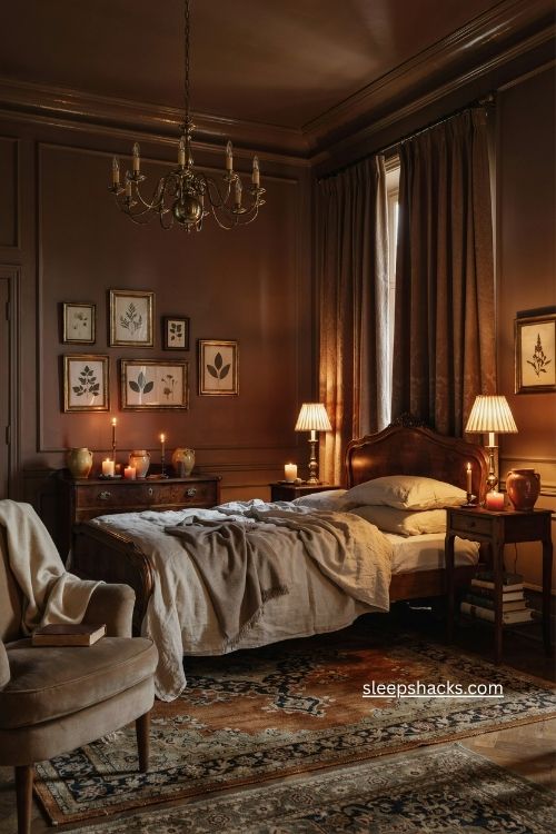
Rich brown walls make a bedroom feel dramatic and romantic, especially with a statement chandelier hanging overhead. The colour is warm and grounding, like being tucked inside a cozy library.
A glossy finish on the trim catches the light and keeps the room from feeling flat. Pair brown with cream bedding, brass fixtures, and plenty of candlelight for an elegant, old-world feel. It’s a great pick if you often read in bed or want a room that feels entirely separate from the rest of the house, a quiet place to disappear into.
11. Mossy Green Like a Forest Retreat
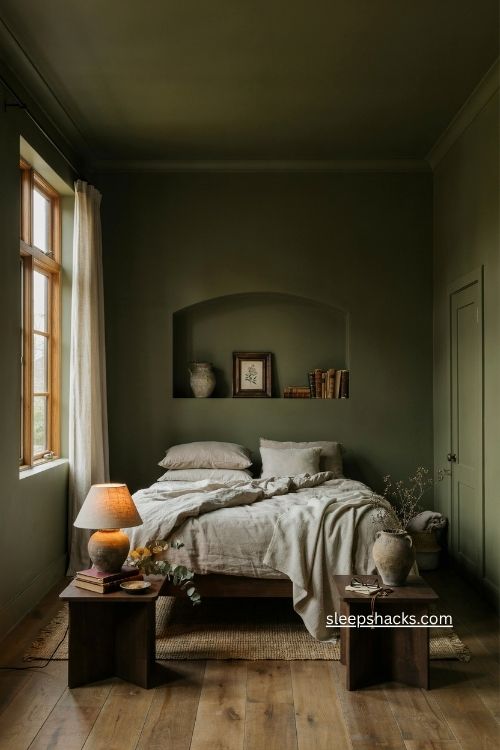
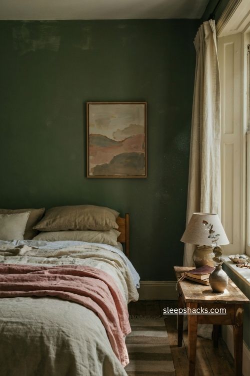
Don’t write off a moody, mossy green before you’ve tried it. Even homeowners who start out unsure often fall in love once the walls are painted, because the colour feels like an enchanting forest-like retreat.
Painting the walls, trim, and ceiling in one deep olive creates a seamless, monochrome look. Complement it with deep browns and neutral textiles, like oatmeal linen and wool throws. The result is earthy and peaceful. If a full room feels like too much, start with a guest room, and see how the colour changes through the day.
12. Rich Purple for Quiet Luxury
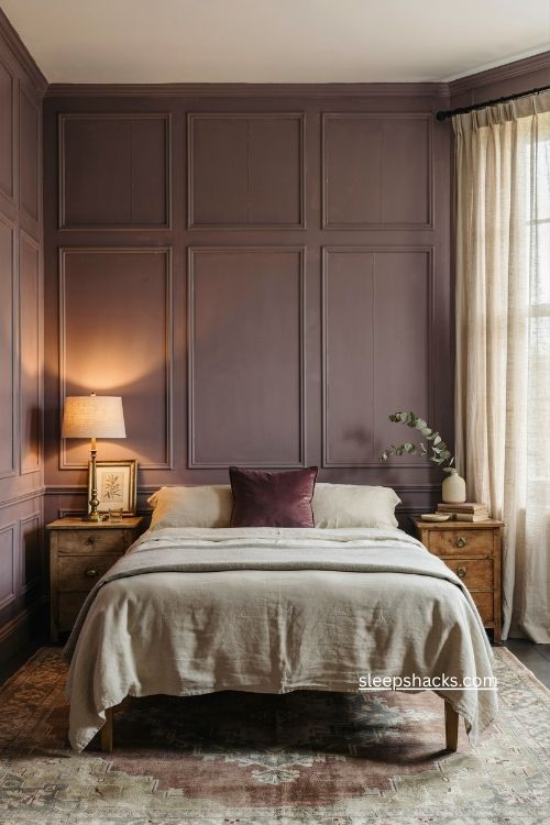
Purple bedrooms may be controversial, but the right shade creates a soothing, cocooning space. A deep, dark purple brings richness, warmth, and drama, and it’s popping up in interiors more and more.
For a softer take, try a mauve-purple on wood paneling for a sophisticated, countryside feel. Keep your bedding simple in cream or gray so the walls stay the star. Add a velvet cushion or a gold lamp for extra glamour. Purple is often linked with luxury and creativity, which makes it a thoughtful choice for a room where you want to feel pampered.
13. Moody Teal on a Shiplap Accent Wall
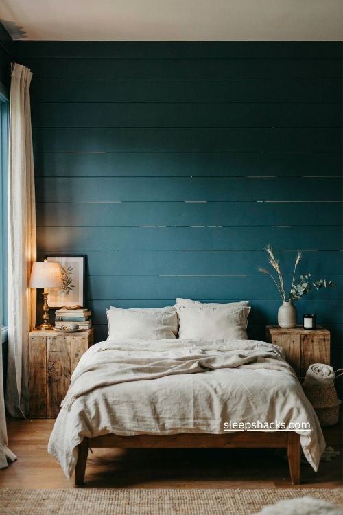
Teal sits between blue and green, and a darker, grayer version feels both relaxing and a little mysterious. It’s especially striking on a shiplap accent wall, where the grooves catch the light and add depth.
If you don’t want to commit to the whole room, painting just the wall behind the bed is a great compromise. Keep the other walls a soft white so the teal stands out. Add wooden furniture and a few brass details for a farmhouse feel, and you’ll have a bedroom with real personality.
14. Blue-Black for a Deep, Sleepy Escape
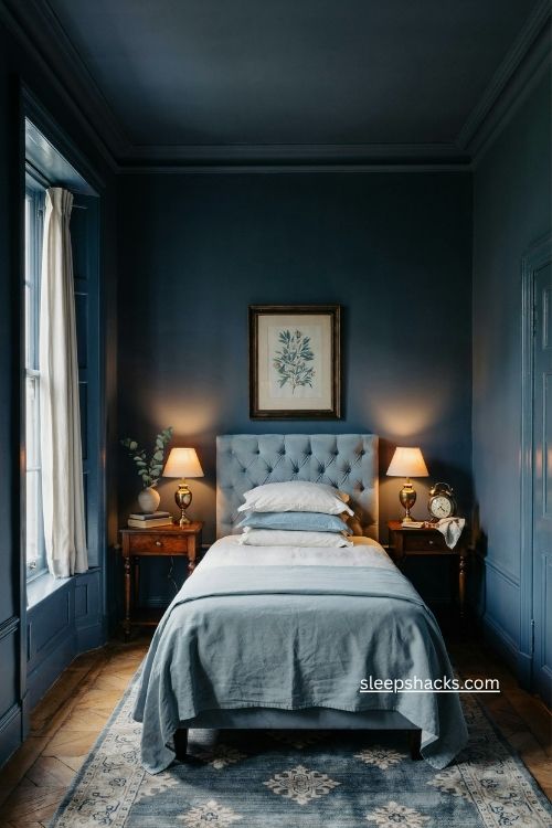
Want to go even deeper than navy? A dark blue-black shade makes a bedroom feel like a quiet night sky. It’s cool, calm, and surprisingly cozy once the lamps are on.
To keep it from feeling too heavy, add a pop of lighter blue through art, rugs, or pillows. Glossy trim and window frames add a polished edge. If you tend to sleep better in a dark room, this colour supports that mood beautifully, and it makes bright bedding look crisp against the walls.
Final Thoughts
Think about the last time a room made you feel instantly at ease. Was it the colour of the walls, the way the light fell across them, or something quieter, like how the shade matched the way you wanted to feel?
Maybe your perfect bedroom isn’t the one you’ve been told to want. Maybe it’s soft blue and breezy, or maybe it’s a deep, dark red that makes the rest of the world fade away for a while. When you picture yourself stepping through the door after a long day, which colour do you see waiting?
Frequently Asked Questions
Q: What is the best colour for a relaxing bedroom?
Soft blue, sage green, and warm neutrals like light beige or taupe are popular for their calming effect. Choose the one that matches how you want the room to feel.
Q: Can I use a dark colour in a small bedroom?
Yes, deep shades like charcoal, forest green, or blue-black can make a small room feel cozy and wrapped. Painting the walls, trim, and ceiling in the same colour helps the space feel intentional.
Q: How do I choose a bedroom colour if I can’t decide?
Start by thinking about the mood you want, whether airy, cozy, or dramatic. If you’re still unsure, versatile shades like soft blue or light beige work with almost any style.