

Spring always has this magical way of sneaking up on me. One morning, I’ll be trudging through gray streets, clutching a hot cup of coffee, and by the afternoon, suddenly everything feels lighter—the air smells fresher, and the first flowers start peeking through their winter blankets. It’s in those small, fleeting moments that I realize how color can completely change a space or a mood.
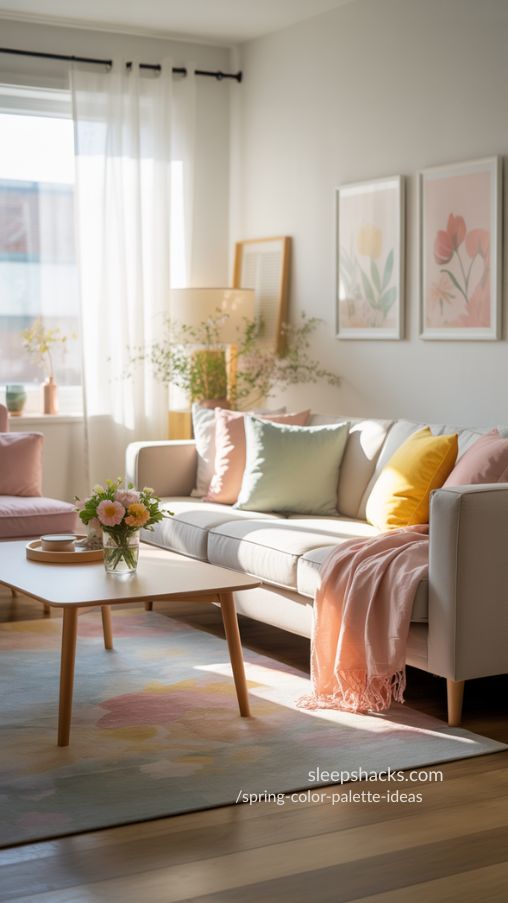
Over the years, I’ve played with dozens of spring color palettes in my own home, from soft pastels that calm my mind to bold floral hues that make me feel alive. Today, I want to share 20 spring color palette ideas that have inspired me the most, whether for interiors, fashion, or creative projects.
- Soft tones can calm any room instantly
- Combining neutrals with bright shades balances energy
- Nature is the ultimate guide for harmonious color
1. Pastel Primavera – Soft Hues for a Serene Spring Vibe
Soft, Calm, and Refreshing
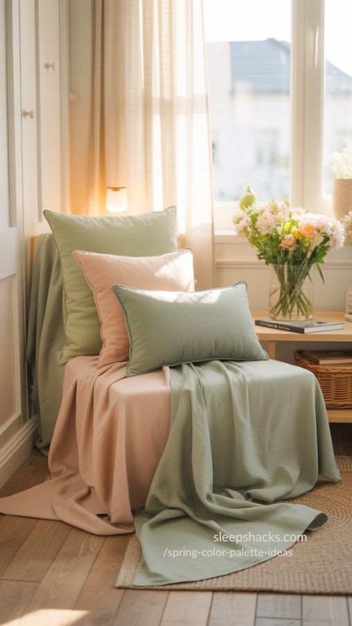
Pastel Primavera has been my go-to palette whenever I need to slow down and just breathe. Light greens, mint, and peach come together in such a harmonious way that even a cluttered room feels calm. I remember painting my reading nook in these colors last year, layering a soft mint chair with peachy cushions, and suddenly, it became my favorite corner of the house.
This palette is not just for interiors. It’s perfect for wardrobe inspiration, stationery, or even digital design projects. Pairing these colors with creamy whites makes the space feel spacious and airy, like spring itself has entered the room.
- Mix pastels with neutral whites for balance
- Layer textures like linen and soft cotton
- Use floral accents to enhance the palette
2. Dawn in Blooms – Capture Vibrant Spring Energy
Bright, Cheerful, and Optimistic
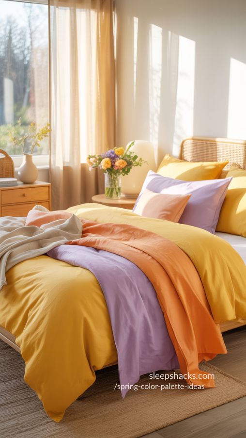
Dawn in Blooms always reminds me of morning walks in the tulip fields near my town. Mustard yellow, soft orange, purple, and light hazel capture that playful vibrancy. I once used this palette for a bedroom accent wall, and the energy it brought was incredible—it felt like the room was waking up with me every morning.
For home decor or fashion, this palette works beautifully with complementary neutrals. Adding natural wood tones or beige accessories balances the brightness, making the space lively but not overwhelming. It’s a joyful, confident palette that encourages creativity.
- Pair with neutral wood or beige accents
- Use bold hues as statement pieces
- Introduce small floral elements for charm
3. Blooming Meadow – Soft Pastels for Calm Interiors
Gentle, Natural, and Inviting
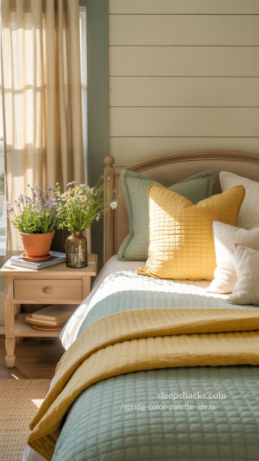
Blooming Meadow is one of those palettes that feels like stepping into a soft meadow at dawn. Warm yellows and gentle greens blend together to create a relaxing atmosphere, perfect for bedrooms or quiet corners. I painted my guest room in these shades and added potted plants—it instantly became the coziest space in the house.
These colors are also great for craft projects or digital illustrations. The key is to balance pastels with subtle neutrals, like cream or soft gray, which prevents the room or design from feeling too sweet or monochromatic.
- Combine with cream or gray accents
- Introduce natural textures like wood or linen
- Keep patterns subtle to maintain calmness
4. Lavender Haze – Elegant and Serene Spring Tones
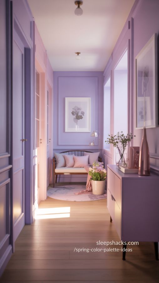
Sophisticated, Soft, and Dreamy
Lavender Haze is like a morning mist in a lavender field—it’s soothing yet lively. I painted a feature wall in my hallway with soft lavender shades last spring, and even my cat seemed calmer lounging there. This palette pairs beautifully with soft pinks, whites, or deeper purples for contrast.
For fashion, Lavender Haze works wonders in dresses, scarves, or accessories, especially when mixed with light neutrals. The elegance of this palette makes it ideal for spaces or outfits where you want to exude calm sophistication without being too muted.
- Pair with soft pinks or whites
- Add metallic accents for subtle elegance
- Use in small or large areas depending on mood
5. Cherry Blossom Sky – Romantic Spring Pastels
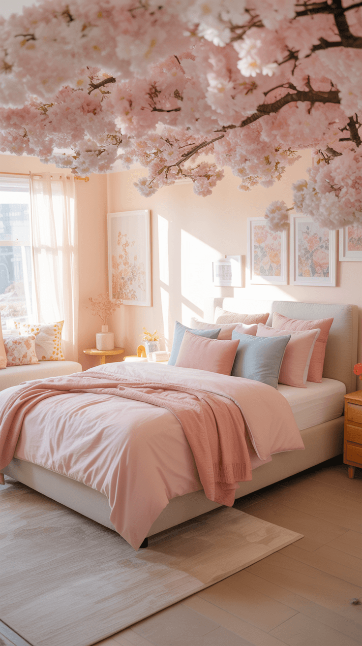
Light, Airy, and Playful
Cherry Blossom Sky instantly transports me to a Japanese garden in early April. Pinks, corals, and pale blues capture the delicate romance of cherry blossoms in bloom. I love using this palette on greeting cards and seasonal artwork because it brings out such a gentle, uplifting feeling.
In interiors, the combination works well in bedrooms, kitchens, or even craft rooms. Layer the colors in textiles, wall art, or furniture pieces to evoke charm and sophistication. It’s playful without being childish, and it always adds a touch of magic to any project.
- Mix blues with pinks for softness
- Use floral patterns for authenticity
- Keep small accents in bright shades
6. Spring Magnolias – Classic Pink and Cream Elegance
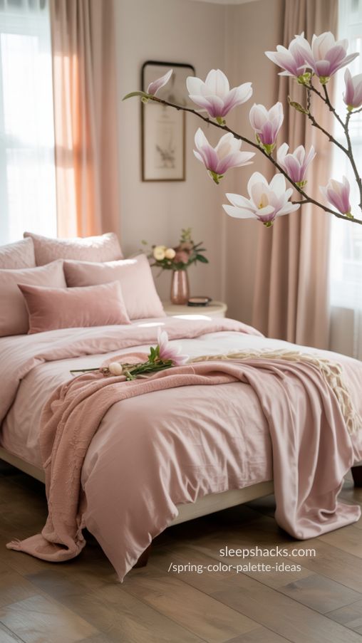
Timeless, Feminine, and Inviting
Spring Magnolias is one palette that feels effortlessly elegant. Shades of pink and cream create a soothing, feminine vibe that I used in my own bedroom last year. I added blush bedding and cream curtains, and suddenly, the room felt like a gentle embrace each morning.
This palette works for branding, digital illustrations, or even wedding decor. Its classic tones are versatile enough to feel fresh while maintaining sophistication. Layering textures like silk, cotton, or velvet adds depth and creates visually inviting spaces.
- Use cream as the base for balance
- Pair with soft textures for depth
- Add subtle metallic accents for elegance
7. Peachy Tulips – Warm and Inviting Spring Colors
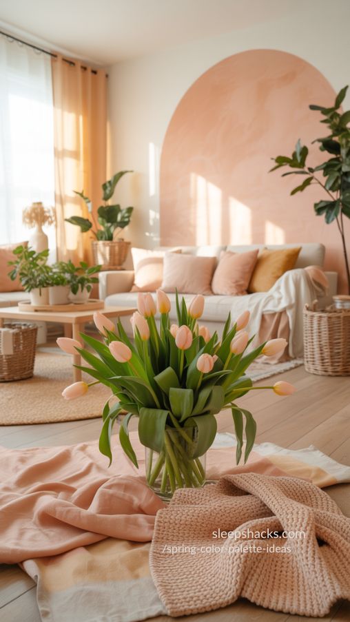
Cozy, Natural, and Soft
Peachy Tulips is like biting into a fresh peach on a sunny afternoon. The mix of peach, pink, and olive-green-brown makes rooms feel cozy and approachable. I painted a small side wall with these shades, added leafy plants, and it transformed the space into a natural spring retreat.
It works beautifully for craft projects, seasonal fashion, or even floral illustrations. Pairing it with muted neutrals balances warmth and prevents the palette from feeling too saturated. It’s perfect for creating inviting, joyful corners.
- Balance with muted neutrals
- Add greenery for natural harmony
- Highlight with soft wood textures
8. Forget-Me-Nots – Fresh Blues and Greens
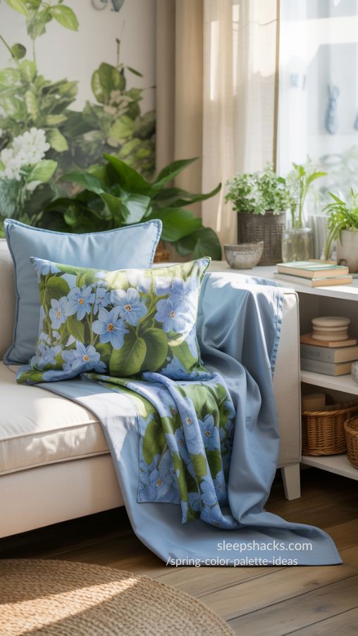
Calm, Refreshing, and Natural
Forget-Me-Nots is a palette inspired by nature’s gentle blues and greens. Walking through a garden of forget-me-nots always reminded me of this mix, and it brings that freshness into interiors. I used it for a small reading nook, layering blues with leafy accents—it instantly felt peaceful.
This palette is perfect for artwork, seasonal stationery, or subtle room updates. Mixing the greens and blues with white or light cream ensures that the colors pop without overwhelming the space, evoking a sense of clarity and renewal.
- Combine with white for brightness
- Incorporate leafy decor or accents
- Balance bold hues with subtle neutrals
9. Moody Iris – Deep and Dreamy Spring Purples
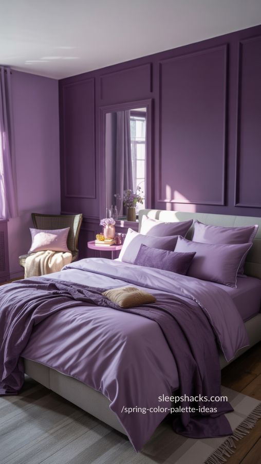
Elegant, Calm, and Mystical
Moody Iris always reminds me of twilight skies over spring fields. Deep purples with soft lilacs create a mood of mystery and elegance. I painted a feature wall in this palette, and even a simple reading chair looked regal and inviting.
This palette is ideal for bedrooms, accent walls, or digital art. Layer lighter shades to soften darker purples or mix with neutral grays. The contrast between soft and deep tones evokes a dreamy, sophisticated vibe that feels uniquely personal.
- Layer dark and light purples
- Pair with gray neutrals
- Use in feature walls for focus
10. Viburnum Petals – Classic Pink and Blue Combo
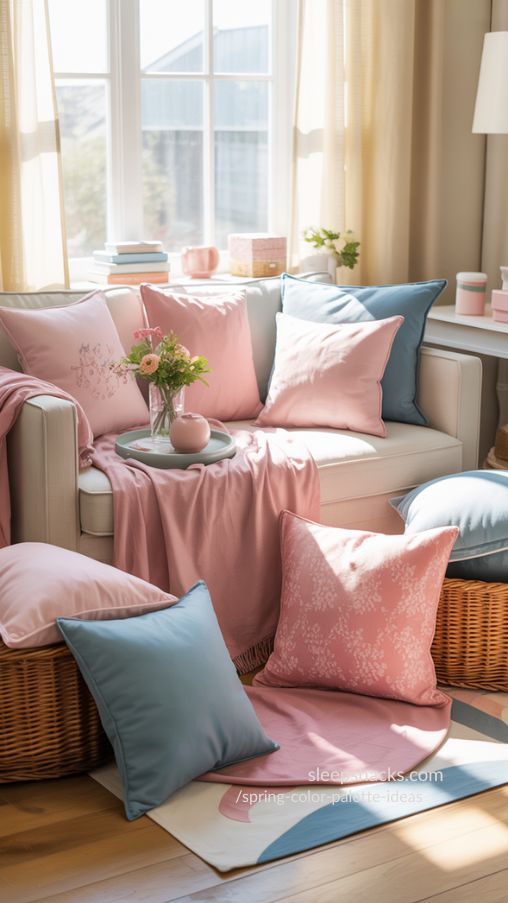
Balanced, Cheerful, and Fresh
Viburnum Petals blends soft pinks with muted blues to create a classic spring palette. I love this combo for floral arrangements and table decor. One year, I painted a small craft room in these colors, and it instantly brightened my creative space.
For home decor, fashion, or illustrations, this palette is versatile. Pair the pinks with blues in furniture, textiles, or digital artwork. Adding soft neutral accents keeps the palette balanced and visually appealing without feeling over the top.
- Pair pink and blue for contrast
- Introduce neutrals to balance
- Use patterns subtly for interest
11. Spring Bright – Feminine and Playful Hues
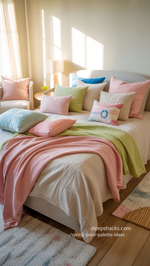
Cheerful, Lively, and Light
Spring Bright combines playful pinks, greens, and blues, instantly lifting my mood. I love using it for seasonal craft projects or DIY room makeovers. It feels like a fresh breeze, perfect for small accent walls or pillows.
This palette works in fashion or digital design too. Layering saturated colors with pale pastels creates a lively yet harmonious composition. Use white as a backdrop to make the hues pop. It’s playful, feminine, and ideal for spaces or projects that need cheer.
- Use pale pastels to balance saturation
- Add white to make colors pop
- Layer textures for visual interest
12. Yellow Summer – Sunshine and Sky Blues
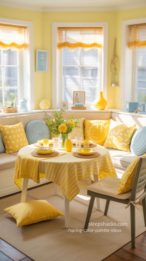
Bright, Optimistic, and Fun
Yellow Summer reminds me of walking through a field of daisies under a clear sky. Sunny yellows and sky blues bring energy to any room or design. I once redecorated a small dining nook in this palette, and it felt like summer had arrived indoors.
This palette works beautifully for cheerful accents in bedrooms, tablescapes, or fashion. Pairing with light neutrals softens the intensity. Small pops of complementary colors can highlight key areas and bring balance to bright designs.
- Pair yellow with soft neutrals
- Highlight with small accent colors
- Use light blue for contrast
13. Crocus Blooms – Soft Purples with Sunny Highlights
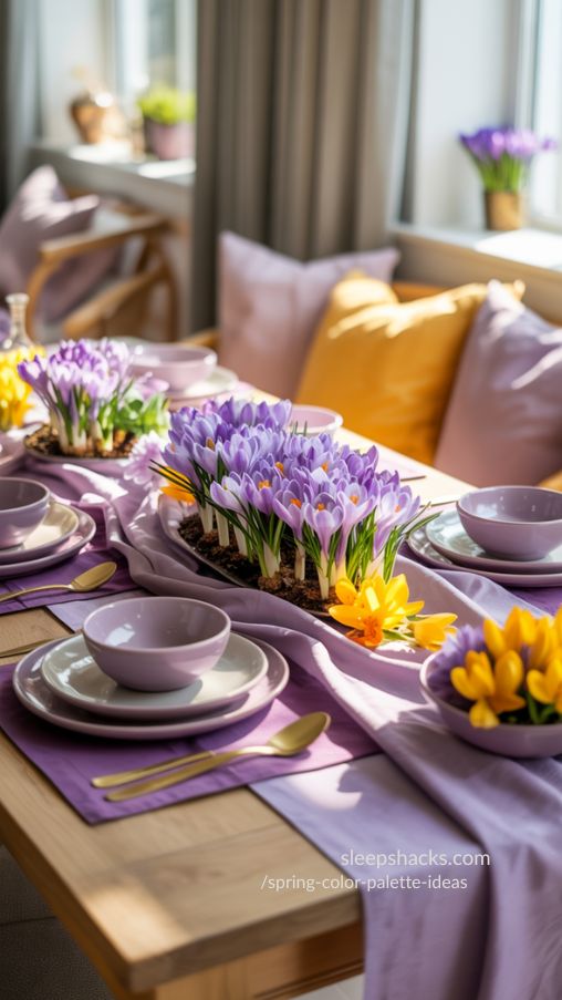
Fresh, Uplifting, and Elegant
Crocus Blooms blends muted purples with bright yellow highlights. I used this combination on a spring tablescape, and it instantly felt seasonal and cheerful. These colors bring a sense of playfulness while maintaining sophistication.
Ideal for interior accents, floral arrangements, or fashion accessories. Layer muted tones with brighter pops for depth. Using creams or off-whites in combination creates a polished, elegant feel without losing the freshness of spring.
- Pair muted purples with yellow highlights
- Use creams for balance
- Layer tones for depth
14. In Bloom – Fresh Greens and Pinks
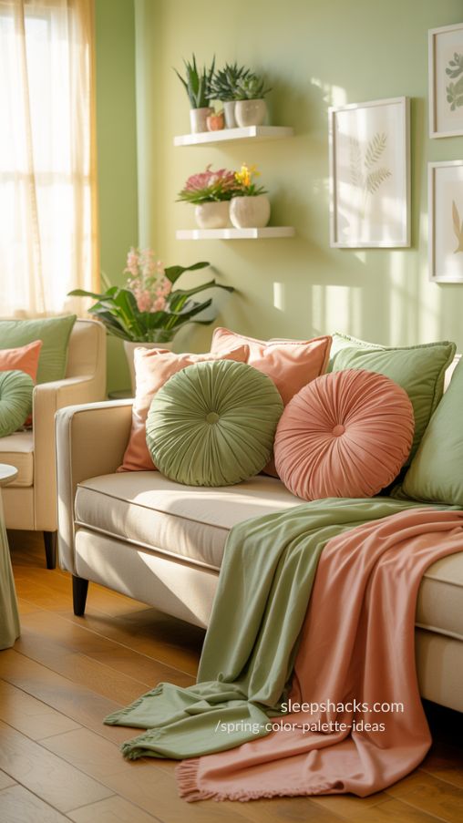
Revitalizing, Natural, and Playful
In Bloom combines soft greens with vibrant pinks for a lively spring palette. I applied it to my craft wall last year, mixing paint swatches and floral prints, and it instantly felt revitalizing and joyful.
This palette works perfectly for seasonal decor, illustrations, and fashion accents. Combining bright and muted shades adds dimension. Small neutral touches like beige or white can ground the palette, making spaces feel cheerful but balanced.
- Combine muted and bright shades
- Use neutral touches for grounding
- Add floral textures for vibrancy
15. Hey Little Cherry Blossom – Romantic Spring Accents
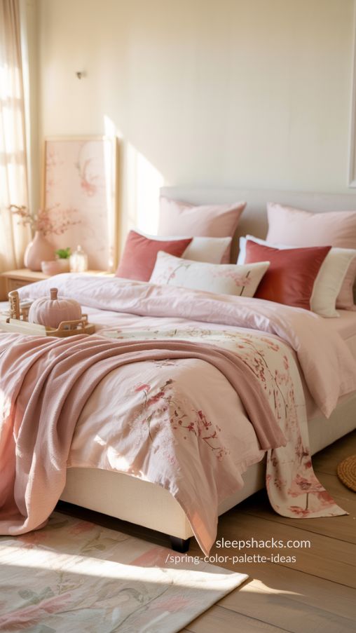
Soft, Feminine, and Sweet
Hey Little Cherry Blossom reminds me of quiet strolls under blooming trees. Pinks, reds, and soft neutrals create a romantic, gentle vibe. I love using this palette in bedroom decor or bridal-inspired crafts.
Mixing it with white or cream tones keeps it light and airy. Perfect for tablescapes, artwork, or small home accents. The palette’s softness adds warmth and charm, making it feel personal and inviting for any spring-inspired project.
- Pair with white for airiness
- Use soft textiles for warmth
- Highlight small accents for charm
16. Blowin’ in the Wind – Olive and Purple Harmony
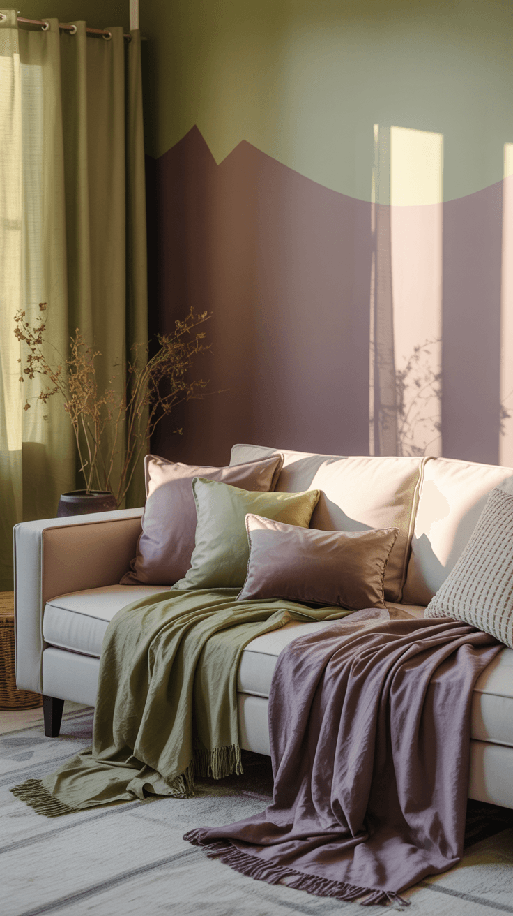
Earthy, Calm, and Sophisticated
Blowin’ in the Wind blends olive greens with muted purples. I used this palette for a small accent wall with soft lavender curtains, and it immediately created a peaceful, evening-like feel.
This combination works in interior accents, seasonal fashion, or floral arrangements. Pair it with cream or beige for balance. It evokes subtle sophistication and calm energy, making spaces feel grounded and stylish.
- Pair olive and purple for harmony
- Use neutrals for balance
- Highlight accents with soft textures
17. Crocus Field – Purple-Gray Elegance
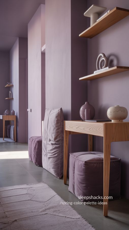
Moody, Minimal, and Stylish
Crocus Field combines muted purples and soft grays for understated elegance. I used it in a small hallway and paired it with light wood accents; the result felt cozy yet sophisticated.
It’s perfect for interiors, tablescapes, or digital illustrations. Layer grays and purples in furniture, accessories, or textiles. Using contrasting textures, like matte and glossy surfaces, adds interest while maintaining a calm, polished aesthetic.
- Pair with light wood or beige
- Layer textures for depth
- Keep patterns minimal
18. Deep Blooms – Moody and Lush Spring Colors
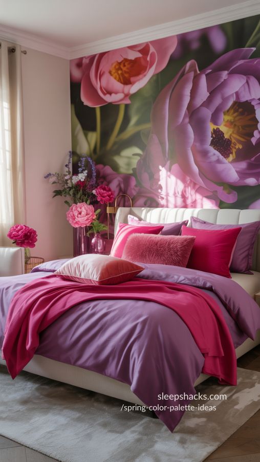
Dramatic, Luxurious, and Bold
Deep Blooms is a palette of rich purples and bright pinks that always feels indulgent. I painted a feature wall in this palette, and it transformed a dull corner into a luxurious, dramatic space.
Perfect for accent walls, fashion statements, or floral-inspired projects. Use deep tones with lighter neutrals to soften the effect. The combination feels bold yet welcoming, ideal for adding richness without overwhelming a space.
- Pair deep colors with soft neutrals
- Use as a feature accent
- Layer bright pops for interest
19. Happy Hydrangeas – Soft Pastels with a Cheerful Twist
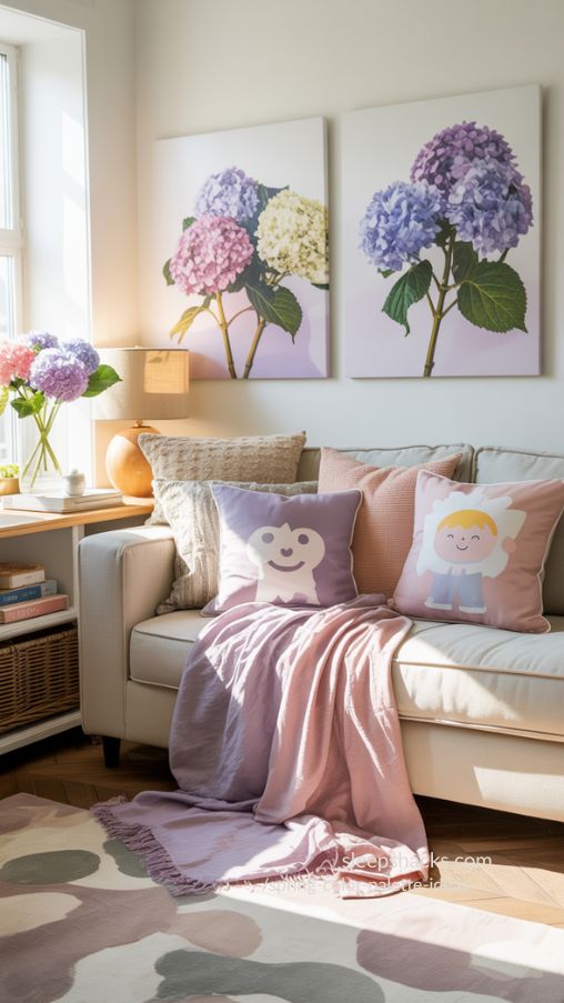
Bright, Gentle, and Inviting
Happy Hydrangeas combines soft purples, pinks, and neutrals, bringing cheerful spring energy. I decorated a small nook with cushions and artwork in these shades, and it instantly felt uplifting and cozy.
This palette works for interiors, fashion, and digital illustrations. Pair pastel tones with light neutrals to maintain balance. It’s perfect for creating spaces or projects that feel fresh, happy, and welcoming.
- Mix pastels with neutral tones
- Use textures for depth
- Highlight playful accents
20. Summer Hydrangeas – Deep Greens with Lavender Accents
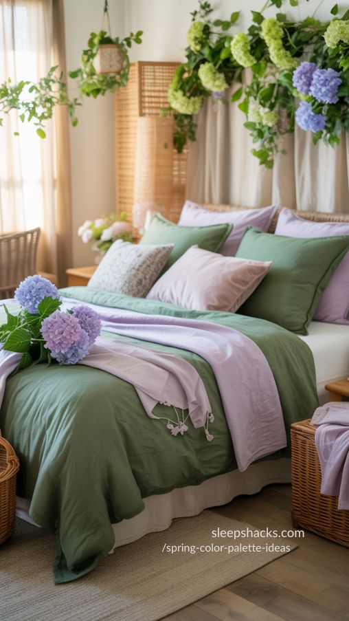
Fresh, Natural, and Inspiring
Summer Hydrangeas blends deep greens with lavender and soft pinks. I love how it reminds me of summer gardens just before sunset. Using it for bedroom accents or seasonal artwork instantly brings calmness and freshness to any space.
Pairing the greens with soft lavender creates balance and highlights the vibrancy of the season. This palette is ideal for seasonal projects, floral designs, or creative decor that wants to capture the serenity and inspiration of spring.
- Pair greens with soft lavender
- Use neutrals to ground the palette
- Incorporate natural textures for authenticity
Table 1: Example Hex Codes for Top 5 Spring Color Palettes
| Palette Name | Key Hex Colors | Mood/Use Case |
| Pastel Primavera | #D4E0CC, #FFE5B4, #A8D8B9 | Calm, serene interiors |
| Dawn in Blooms | #FFC966, #FFAA7A, #D987BB | Energetic, bright accents |
| Blooming Meadow | #F6E1A8, #A8D8B9, #D8F4C6 | Relaxing, pastel interiors |
| Lavender Haze | #E1C2EB, #BAC7FB, #C46FB2 | Elegant, bedroom or office |
| Cherry Blossom Sky | #FFA7A6, #FFDCDC, #F25477 | Romantic, feminine decor |
These colors can be mixed or matched for rooms, fashion, or seasonal projects, offering a simple guide for quick inspiration.
Table 2: Practical Tips for Using Spring Color Palettes
| Tip | Description |
| Mix with Neutrals | Softens bright tones and balances visuals |
| Layer Textures | Adds depth and interest to single-color schemes |
| Use Seasonal Accents | Flowers, pillows, or decor items bring palettes to life |
Using these three strategies ensures your color palette feels intentional, balanced, and fresh without overwhelming any space or design project.
FAQ Section
What is the best spring color palette for a bedroom?
Soft pastels like Blooming Meadow or Lavender Haze create calm, relaxing spaces perfect for sleep and tranquility.
Can I mix bright and muted colors in one palette?
Yes, combining muted pastels with bright accents adds energy while maintaining balance and cohesion.
How do I choose the right palette for fashion?
Consider your skin tone, mood, and occasion. Soft pastels work for casual spring outfits, while bold tones like Dawn in Blooms make statement pieces.
What are easy ways to apply these palettes at home?
Use accent walls, pillows, throws, or small decor items to introduce colors without overwhelming the room.
Are these palettes suitable for digital projects?
Absolutely, these palettes work beautifully in illustrations, graphics, social media visuals, or branding projects.
Which palette feels most versatile for interiors?
Spring Magnolias or Pastel Primavera blend well with neutral tones, making them ideal for multiple rooms and design styles.