

When it comes to making your guest room feel like a warm, welcoming retreat, the right guest room paint color ideas can truly transform the space. I remember the first time I tried to pick a color for my own guest room—I was overwhelmed by endless swatches and conflicting advice. Should it be calming, neutral, or bold? Ultimately, I learned that the best choice balances comfort, personality, and light. Guests should feel cozy the moment they step in, like they’re being wrapped in a soft, familiar hug. Painting a guest room isn’t just about aesthetics; it’s about creating an emotional space where people feel at home. I experimented with soft blues, warm creams, and even a hint of blush, each choice shifting the room’s mood in subtle ways. Over time, I realized that paint doesn’t just change walls—it changes how people feel the moment they enter. The goal is simple: a room that says, “Relax, you belong here.”
Key Points:
- Neutrals are versatile and timeless
- Soft tones enhance calmness and relaxation
- Accent walls add personality without overwhelming

Why Choosing the Right Guest Room Paint Color Matters
Choosing a paint color for your guest room might seem minor, but it sets the tone for the entire experience. When I host friends or family, I notice that the colors around them subtly affect their mood. Warm tones make them feel cozy and energized, while cool blues or greens help them unwind after a long journey.

Paint communicates a lot without words—it can be inviting, serene, or even luxurious. Your choice also influences room perception; lighter colors make small rooms feel airy and expansive, while darker tones can make a spacious room feel intimate. I’ve learned to consider not just personal preference but also the guest experience. It’s like setting a background track for a movie—the color is the unspoken story.

Top Neutral Colors for a Calm and Versatile Guest Room
I’ve always had a soft spot for neutral shades because they feel timeless and versatile. Think beige, taupe, soft gray, and off-white. When I painted my guest room a warm taupe, it immediately made the space feel cozy but adaptable. The best thing about neutrals is that they blend seamlessly with any décor or accent piece you add later. A pop of green plant, a colorful throw, or even a patterned rug suddenly stands out beautifully against a neutral backdrop. Neutral shades also make multi-purpose rooms easy to manage.

If you occasionally use the guest room as a workspace or meditation spot, these colors won’t clash with functional elements.
Table 1: Popular Neutral Guest Room Paint Colors
| Color Name | Mood | Best Lighting | Tip |
| Beige | Warm & cozy | Natural light | Pairs with colorful accents |
| Taupe | Calm & sophisticated | Soft LED | Works well with wooden furniture |
| Light Gray | Modern & airy | North-facing rooms | Balances bold décor elements |
| Off-White | Bright & spacious | Any | Perfect backdrop for textiles |
Soft Blues and Cool Tones for Relaxation

Blue has always been my go-to when I want a room to feel peaceful. Soft blues, aqua, or pastel teal create a serene vibe that encourages rest. I painted one wall in a soft blue once and noticed that guests lingered longer, chatting and relaxing instead of rushing out. Cool tones also pair well with natural elements, like wooden furniture or indoor plants.

These shades evoke a quiet seaside morning or a calm lake, transporting you from the chaos of daily life. If your guest room faces direct sunlight, soft blues can balance the warmth and prevent glare, making it an easy, soothing choice.
Soothing Greens to Bring Nature Indoors

There’s something inherently calming about green—it reminds us of forests, parks, and quiet gardens. I love sage or mint green for a guest room because it brings a natural, refreshing feel indoors. When I painted my room in sage, it immediately felt like breathing in calm air.

Green works beautifully with neutrals and even warm accents, creating a harmony that feels effortless. Guests often comment that the space feels “restful,” which is exactly the goal. I also like pairing green with light wooden furniture, creating a subtle Scandinavian-inspired look that’s inviting but never cold.
Warm and Cozy Guest Room Paint Options
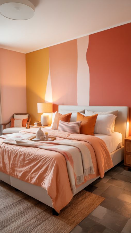
If your guest room struggles with natural light or feels a bit chilly, warm tones are a lifesaver. Peach, coral, soft reds, and golden yellows can make a north-facing room instantly inviting. I remember painting my first guest room a soft peach, and even on cloudy days, it seemed cheerful. Warm colors don’t just add energy—they make a space feel embracing and alive.
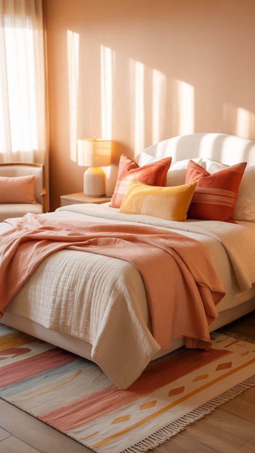
I tend to balance them with neutral furniture or simple white accents to prevent the room from feeling too intense. The trick is subtlety—enough warmth to create comfort without overwhelming the senses.
Rich and Sophisticated Shades for a Luxurious Look

Sometimes, you want your guest room to feel more than just cozy; you want it to exude elegance and depth. Deep navy, forest green, or charcoal gray can make a space feel luxurious. I tried navy in my study-turned-guest-room, and it immediately added sophistication without feeling cold.

These shades work best in well-lit rooms or when paired with lighter accents like cream bedding or metallic lamps. Rich tones create a sense of intimacy and are perfect for winter months or evening relaxation. Think of it like wrapping your guests in a soft velvet blanket—the color itself conveys comfort and style.
Pastel Hues for Cheerful and Inviting Spaces
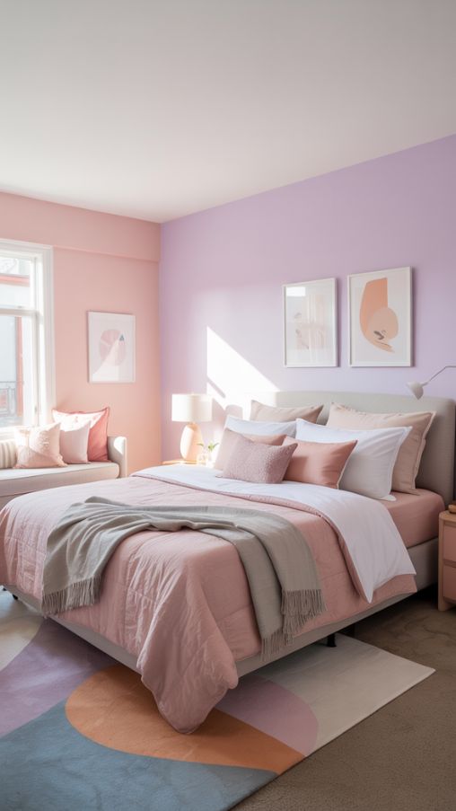
Pastels are underrated in guest rooms, but they can be magical. Soft blush pinks, lavender, and gentle peaches create a welcoming, cheerful vibe. I once painted a small guest room blush pink, and the sunlight bouncing off the walls made the room glow. Pastels work wonderfully in small spaces because they reflect light while adding personality.
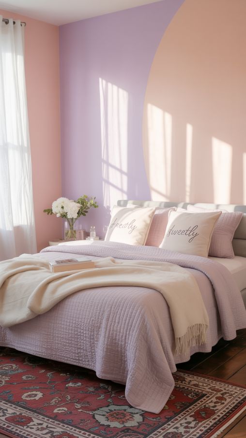
Pair them with whites or muted grays to prevent the room from feeling too sugary. The trick is moderation—one pastel wall, or subtle accents, can brighten the room without making it feel like a child’s playroom.
Accent Walls and Creative Color Combinations

I’ve always loved accent walls for adding character without committing to bold colors everywhere. Painting one wall a deep navy or rich green while keeping the rest neutral can make the room feel curated and dynamic. Accent walls also work well when you want to showcase artwork or a statement piece of furniture.

When I tried this, the guests often complimented how “cohesive yet lively” the room felt. Combining soft neutrals with richer tones ensures balance, making the space feel intentional rather than chaotic.
Table 2: Accent Wall Color Pairings
| Main Wall Color | Accent Wall Color | Mood | Tip |
| Off-White | Navy Blue | Sophisticated | Highlight artwork or bed frame |
| Beige | Coral | Warm & cheerful | Use subtle lighting to enhance depth |
| Light Gray | Forest Green | Calm & elegant | Pair with wooden accents |
Seasonal and Mood-Based Paint Ideas

I often choose colors based on seasons. In autumn, brick reds and earthy tones make the guest room feel snug and festive. During spring or summer, light creams, soft yellows, and airy neutrals bring brightness and freshness. Colors can influence mood more than we realize; painting a room isn’t just decoration—it’s emotional design.

Guests subconsciously respond to these cues, feeling relaxed, energized, or cozy depending on the palette. Seasonal choices can also inspire small décor changes, like matching blankets or throw pillows, creating a layered and thoughtful experience.
Tips for Choosing Guest Room Paint Colors
Here’s where I share what I’ve learned through trial and error. Consider the room size: lighter shades expand small spaces, while darker tones can cozy up larger rooms. Think about natural light—north-facing rooms might benefit from warmer hues. Multi-purpose rooms need versatile colors, like muted neutrals, so work and relaxation coexist. Lastly, always test swatches on multiple walls; paint can look entirely different depending on the lighting and time of day. It’s all about balancing aesthetics, function, and comfort.
Popular Paint Brands and Recommended Shades

Some brands make choosing easier with curated palettes. Sherwin-Williams, Benjamin Moore, Farrow & Ball, and Asian Paints have trusted shades that consistently perform well. For example, Sherwin-Williams Lullaby (soft blue) or Benjamin Moore Sonoma Skies (earthy neutral) are favorites.

Farrow & Ball’s Sunlight adds warmth to north-facing rooms, while Asian Paints offers versatile palettes for Indian homes. Matching your color to furniture, décor, and your home’s natural light ensures the paint enhances the space rather than overwhelms it.
How to Decorate Your Guest Room Around Paint Colors
Once the paint is set, decoration completes the story. Coordinating bedding, rugs, and wall décor with your color palette creates harmony. I like layering textures—soft throws, patterned cushions, and natural elements like plants. Even a neutral room can feel lively with the right accessories. The key is balance; colors shouldn’t compete but complement each other. Personal touches, like framed photos or books, make the room feel lived-in and welcoming. Paint is just the canvas; décor paints the experience.
Common Mistakes to Avoid When Painting a Guest Room
I’ve seen friends make a few classic mistakes: using overly dark colors in tiny rooms, ignoring natural light, or picking too many clashing colors. Any of these can turn a cozy room into a cramped or overwhelming space. Avoid rushing the decision; test multiple swatches, consider furniture, and think about your guests’ comfort. Paint isn’t permanent—you can always adjust, but starting thoughtfully saves stress and money.
FAQs About Guest Room Paint Color Ideas
What is the best color for a guest bedroom?
Soft neutrals, light blues, and calming greens are universally welcoming.
Can I use bold colors in a guest room?
Yes, as accents or on one wall to add personality without overwhelming the space.
Which colors make a small guest room feel bigger?
Off-whites, light grays, and pastel shades reflect light and expand space visually.
Are warm tones suitable for north-facing rooms?
Absolutely, they add warmth and cheer where natural light is limited.
How do I choose paint if the room serves multiple purposes?
Opt for versatile neutrals that blend with furniture and décor styles.
Can pastel shades work in adult guest rooms?
Yes, soft pastels like blush or lavender feel elegant and welcoming.
What are the most relaxing paint colors for guests?
Cool blues, herbal greens, and soft neutrals create a restful vibe.
Should I match décor to the paint or paint to décor?
Start with paint first, then select décor to complement the color palette.