

Copper is the most underrated metal on a Christmas tree. Gold can feel expected and silver can feel cold, but copper sits right in the middle, with a rosy warmth that makes everything around it look richer.
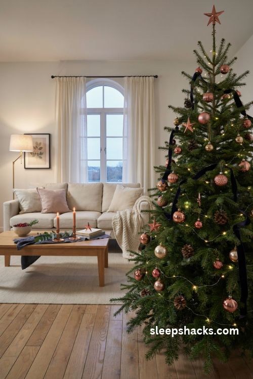
It also plays well with almost anything. Deep navy, forest green, soft blush, matte black, and even plain white all look sharper once a little copper joins them. The 16 color schemes below show you exactly how to pair it, with practical tips on proportions, textures, and finishing touches, so your tree looks designed instead of decorated by accident.
1. Copper and Deep Navy
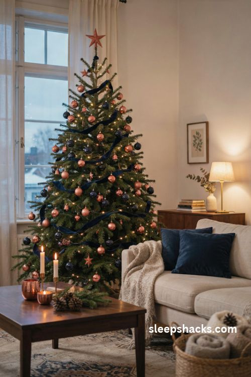
Warm copper and deep navy balance each other beautifully, one glowing and the other mysterious. The pairing feels like a campfire against a night sky, which is exactly the mood you want in a living room in December.
Choose navy velvet ribbon and matte navy ornaments as the base, then scatter polished copper balls and stars through the branches. Keep navy as the dominant color, around 60 percent, so the copper reads as a shimmering accent. Warm white lights bring out the glow in the metal, while cool white lights will flatten it.
2. Copper and Forest Green
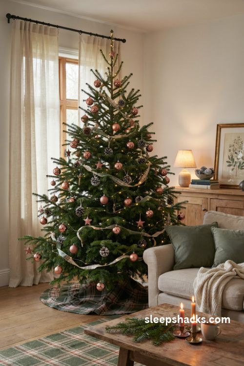
Forest green is already the color of the tree, so this combination feels natural, like the branches themselves are wearing jewelry. Copper adds a bit of warmth against all that deep green without breaking away from tradition.
Use a mix of shiny and brushed copper ornaments so the finish feels layered. Add a plaid ribbon with a touch of green and copper threads running through it. Frosted pinecones painted with a hint of copper work well for filling gaps. This scheme is a friendly choice if you love classic Christmas but want a quieter, more grown-up version.
3. Copper and Soft Gray
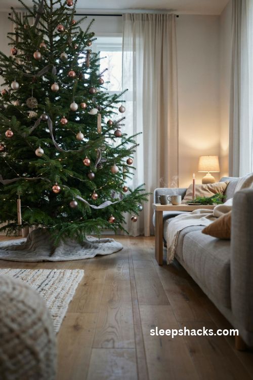
Mixing several shades of gray with copper and camel is a calm, elevated take on neutral Christmas decor. It feels modern and quiet, a bit like a cozy sweater and a good cup of coffee.
Start with a range of grays, from pale dove to charcoal, in matte and glossy finishes. Then add copper in small clusters, so the metal looks like highlights instead of a theme. Wool ribbon or a chunky knit tree skirt in light gray adds softness and texture. This scheme works especially well in homes with gray sofas or wood floors.
4. Copper on a White Tree
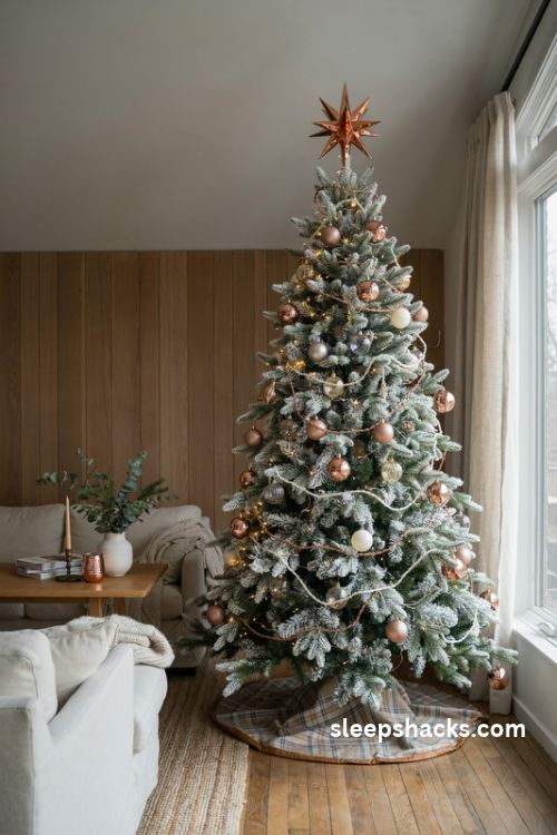
An artificial white tree is a perfect blank canvas for copper, because the metal stands out clearly against the pale branches. It looks fresh, bright, and a little unexpected, especially in a room with wood paneling or warm tones.
Wrap copper wire garland loosely around the tree, then add large copper ornaments and a few clear glass balls. A distinctive tree topper fills in any gaps, and a leather-trimmed plaid skirt brings warmth to the base. Keep lights warm white so the tree doesn’t turn stark, and add a few gray or cream ornaments for contrast.
5. Copper and Blush Pink
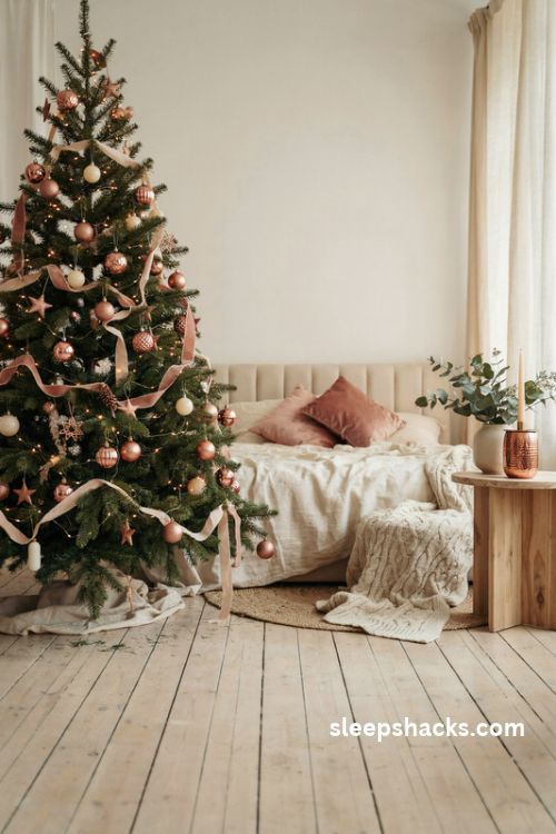
Copper and blush are both warm, rosy tones, so they blend like different shades of the same sunset. This pairing feels soft, romantic, and surprisingly sophisticated, nothing like the candy-colored pink trees you might expect.
Choose a dusty blush rather than a bubblegum shade, and pair it with brushed copper for a vintage feel. Velvet ribbons in muted rose add depth, and a few cream ornaments keep things balanced. This is a lovely choice for a bedroom or a smaller tree, where the delicate palette can really shine without feeling too sweet.
6. Copper and Burgundy
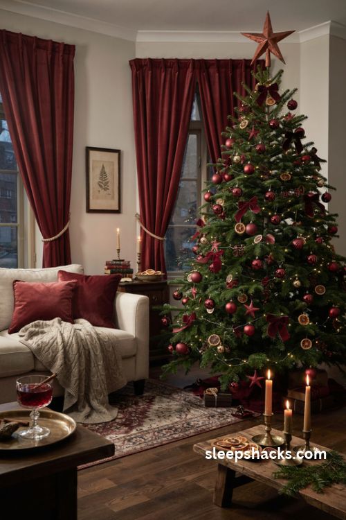
Deep burgundy has a velvety richness that makes copper glow like embers. The combination is moody and festive without leaning on bright red, and it suits a cozy room with dark wood furniture and low lamplight.
Use burgundy velvet bows, matte wine-colored balls, and a few glossy red ornaments to add variety. Place copper balls and stars throughout, and add dried orange slices for a natural touch. Choose a copper tree topper, such as a star or a large bow, to tie the colors together. Keep the lighting warm, and the burgundy will look almost black in the shadows.
7. Copper and Matte Black
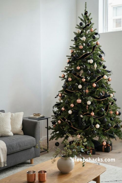
For anyone who wants a sleek, modern look, copper against matte black is a bold, graphic choice. The contrast is sharp, and the copper looks almost like polished jewelry against the dark background.
Pair black ornaments in different shapes, such as balls, geometric pieces, and feathers, with high-shine copper accents. Black ribbon with a copper edge adds a polished finish. This scheme looks great on a flocked or dark green tree, and it stands out especially well in a room with white walls. Add a touch of cream or white ornaments if it starts to feel too heavy.
8. Copper and Warm Cream
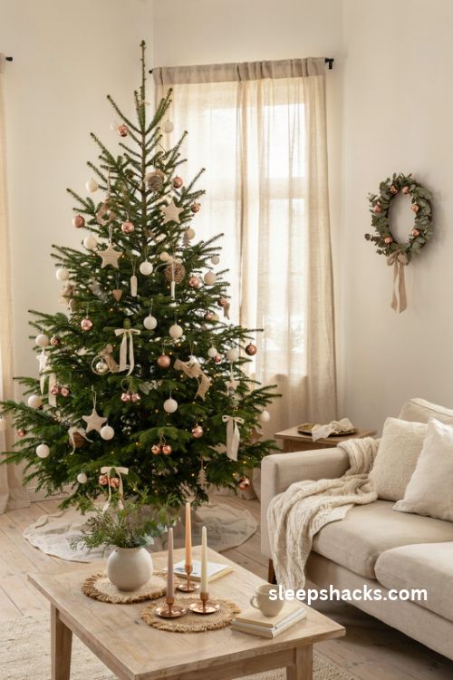
Cream and copper are a soft, gentle pair. The cream keeps things light and airy, while copper adds a gentle shimmer, creating a tree that feels cozy and understated, like a quiet winter morning.
Combine ivory ornaments, knitted stars, and linen ribbon with brushed copper balls and small metal bells. Add texture through wool, burlap, and woven elements so the tree doesn’t look flat. This palette works well in farmhouse and Scandinavian-style rooms, and it’s easy to extend to the rest of your holiday decor, including wreaths and table settings.
9. Copper and Sage Green
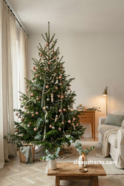
Sage green is soft and earthy, and copper warms it up beautifully. Together they feel like a walk through a winter garden, calm, natural, and a little bit vintage.
Mix sage velvet ribbon with matte green ornaments and brushed copper accents. Eucalyptus stems tucked between the branches add silvery texture and a fresh scent. Because both colors are muted, this scheme looks especially pretty with natural wood elements, such as wooden beads or slices of birch. It’s a good choice if you want something gentle that doesn’t shout for attention.
10. Copper and Burnt Orange
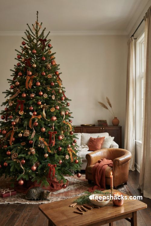
A tone-on-tone palette of copper, rust, and burnt orange is warm and bold, like autumn leaves held over into winter. It feels cozy, slightly retro, and surprisingly festive when paired with a deep green tree.
Layer different oranges, from soft apricot to deep terracotta, and let copper bridge the shades. Use ribbons with a mix of tones so the colors flow together. Dried orange slices, cinnamon sticks, and rust-colored velvet bows tie in naturally. This palette works best with warm lights, since cool ones will make the oranges look dull and muddy.
11. Copper and Teal
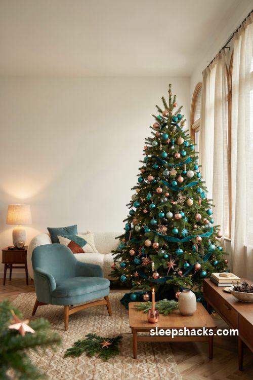
Teal and copper are color opposites, which gives them a lively tension. The cool blue-green makes the copper look warmer, while the copper makes the teal look deeper and richer.
Choose a deep, slightly muted teal, closer to peacock than turquoise. Add glass ornaments in different shades of teal, plus copper balls with a mirror finish. A bit of cream or gold keeps the look from becoming too sharp. This unexpected pairing suits an eclectic or mid-century home, where color feels playful and welcome.
12. Copper and Natural Wood
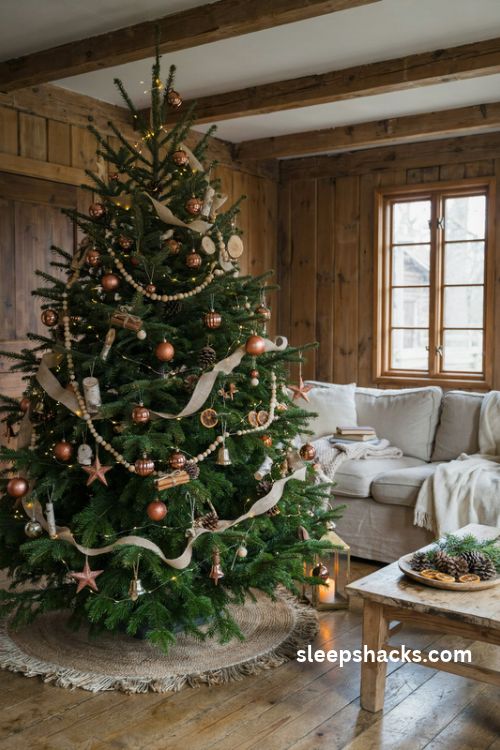
If you love an earthy look, combine copper with wood and natural materials. Wooden beads, birch slices, pinecones, and woven ornaments bring in a warm, organic feel that suits copper’s rustic character.
Drape a wooden bead garland across the branches, then add copper accents in small, evenly spaced clusters. Dried citrus and cinnamon bundles add scent and texture. A burlap or jute ribbon completes the natural look. This scheme feels grounded and cozy, and it works well in cabins, farmhouses, or any home with exposed beams and warm wood tones.
13. Copper and Gold Mixed Metals
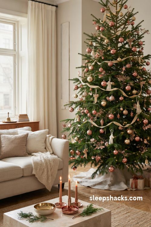
Mixing metals can look messy if done carelessly, but copper and gold are close cousins, and they blend easily. Together, they give a tree that rich, luxurious shimmer without feeling too flashy.
Choose a main metal, such as copper, and use gold as a supporting player. Stick to warm tones and avoid adding silver, which can clash. Vary the finishes, using matte, shiny, and glittered pieces, so the metals catch the light in different ways. A white or cream base keeps the tree from feeling overwhelming and lets the metallics take center stage.
14. Copper and Dusty Blue
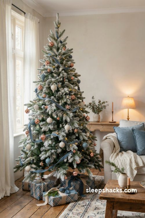
Dusty blue has a soft, vintage character, and copper adds a gentle glow. The pairing feels like old china and antique brass, with a calm, collected charm that never feels loud.
Use dusty blue ribbon and ceramic-style ornaments in various shapes, then dot in copper accents. A few white and cream ornaments help brighten the palette. This scheme looks especially pretty on a white or flocked tree, where the soft blue tones stand out. Plaid and tartan wrapping paper in blue and cream makes a lovely match beneath the tree.
15. Copper and Deep Plum
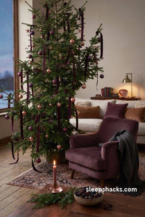
Plum is rich and slightly mysterious, and copper makes it glow. The combination feels luxurious, a little dramatic, and perfect for a room with moody lighting and layered textures.
Pair plum velvet ribbon with matte purple ornaments and polished copper balls. Add a few dark berry stems for depth, and use warm white lights to avoid a cold, purple wash. This scheme works especially well on a dark green tree, where the jewel tones feel natural. Keep the copper in small, shiny pieces to stop the palette from feeling heavy.
16. Copper, Camel, and Plaid
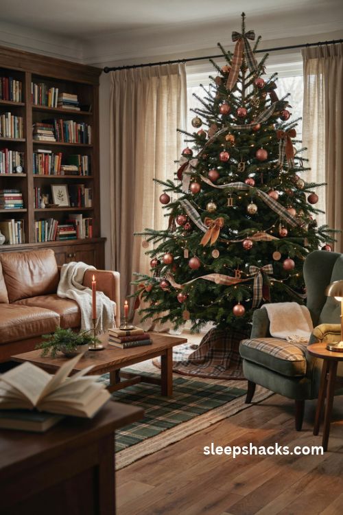
Camel leather, copper metal, and soft plaid fabric come together to create a cozy, library-like look. It’s tailored and warm, with a quiet confidence that never tries too hard.
Use leather-look ribbons and camel velvet bows with copper ornaments, then add a plaid tree skirt with leather piping for a finishing touch. Small leather tags or wooden initial ornaments add personal charm. This scheme pairs beautifully with brown leather sofas, wood furniture, and layered rugs, making the whole room feel like a warm, welcoming retreat.
Final Thoughts
Before you buy anything new, do one small thing this weekend: lay out the ornaments you already own and pull out every piece in a warm metallic tone. Add a single roll of ribbon in the color you like best, whether that’s navy, sage, or blush.
Hang those pieces on the tree first, step back, and see how it looks in the evening with the lights on. Then fill in gaps one ornament at a time instead of buying a whole new set. A copper tree rarely needs more than a few well-chosen additions, and you’ll often find the scheme you want is hiding in your own decoration box already.
Frequently Asked Questions
Q: What colors go well with copper on a Christmas tree?
Navy, forest green, gray, blush pink, burgundy, matte black, cream, and sage all pair well with copper. Warm neutrals and deep jewel tones bring out the metal’s glow best.
Q: Should I use warm or cool white lights with copper ornaments?
Warm white lights are the better choice because they enhance copper’s rosy tone. Cool white lights can make the metal look flat and slightly dull.
Q: Can I mix copper with gold and silver on the same tree?
Copper and gold blend easily because both are warm metals, but silver can clash unless you keep it to a small accent. Choose one main metal and treat the others as supporting touches.