

There’s a certain hush that settles over a house once the first cool morning arrives — the kind that makes you want to light a candle, put on a sweater, and finally do something with that blank chalkboard leaning against the wall.
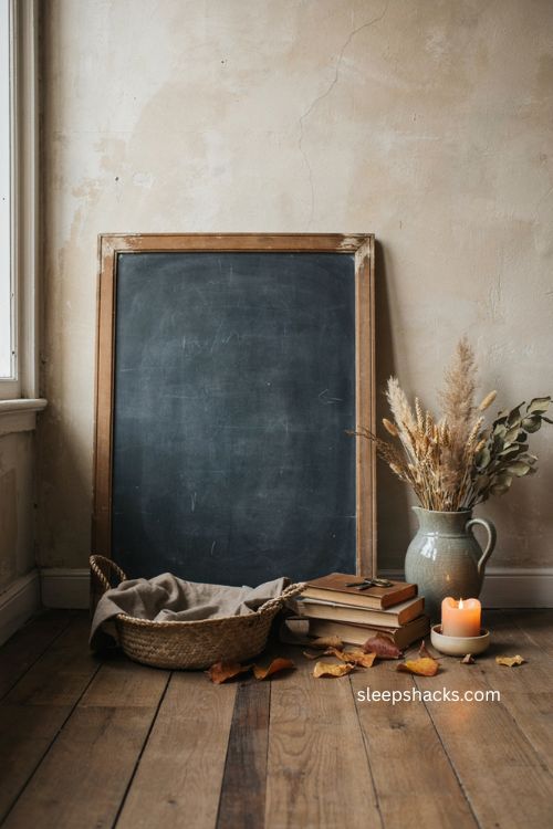
Fall chalkboard ideas give you a way to catch that feeling and hang it somewhere you’ll see it every day, whether that’s a foyer, a kitchen shelf, or a spot above the buffet where dinner conversations happen. Chalkboards are forgiving too — smudge a line, erase a word, start over without a trip to the craft store. The ideas below move well past pumpkins and orange lettering, covering everything from moody botanical sketches to interactive gratitude boards your whole family can add to all season long.
1. Pumpkin Patch Chalkboard Scene
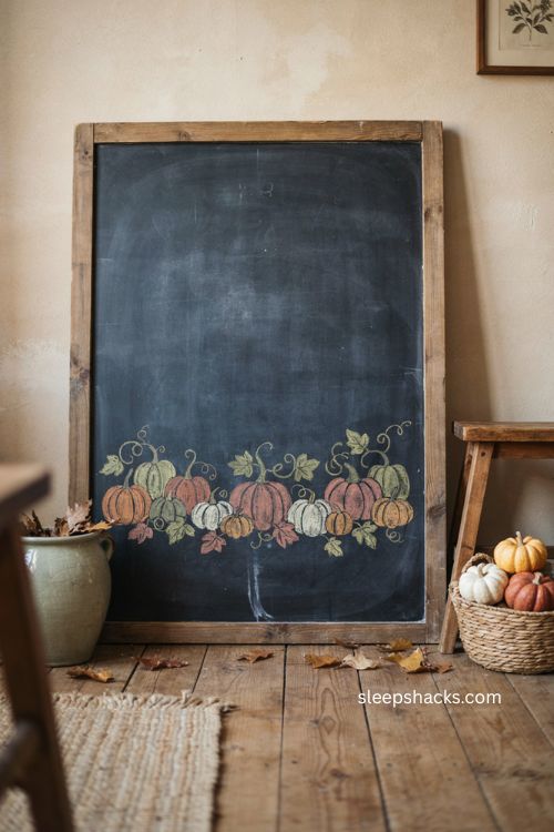
A hand-drawn pumpkin patch turns a plain board into the closest thing to a fall outing you can hang on the wall. Sketch a handful of pumpkins in different sizes across the lower third, add a few curling vines, and scatter a couple of fallen leaves between them so the scene feels a little wild instead of stiff. Traditional chalk works best here because the soft edges make each pumpkin look hand-shaded rather than outlined and colored in. If kids are around, let each person draw their own pumpkin — the mismatched styles actually make the patch feel more real. Hang the finished board somewhere low enough for little hands to add to it later, since this is one design that keeps improving with a little help.
2. Elegant Welcome Fall Lettering
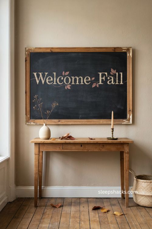
Oversized serif lettering turns a simple greeting into something that reads more like framed art than a seasonal craft. Outline each letter of “Welcome Fall” first instead of writing it in one pass — that single trick keeps the spacing even and gives beginners way more control. Add one thin vine slipping between just a few of the letters, then a handful of small leaves in a single warm color so the board doesn’t turn busy. This one earns its spot in an entryway, where guests see it the moment they walk in. Keep the palette to ivory chalk with one accent color, and leave roughly a third of the board empty so the lettering has room to breathe instead of fighting for attention.
3. Cozy Seasonal Quote Wall
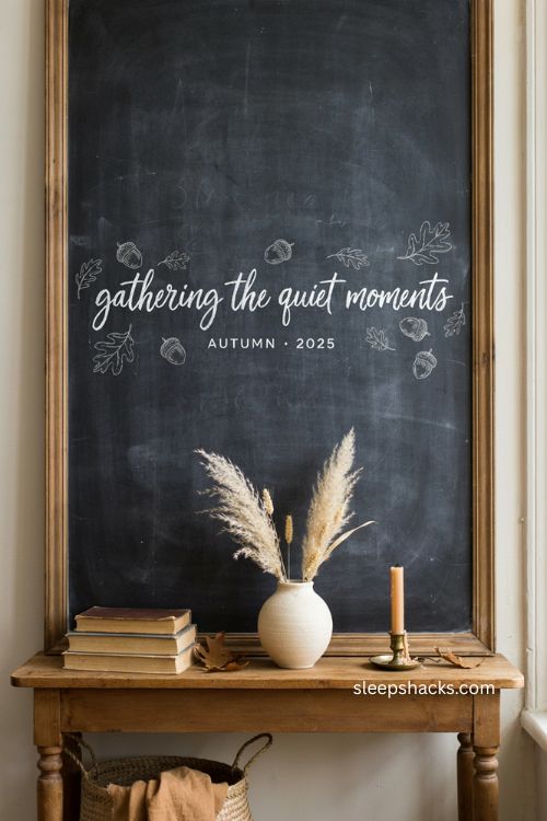
A favorite fall quote gives you more room to play with lettering styles than a single word ever could. Mix cursive for the main line with clean block capitals for a smaller line underneath, then frame the words with a few acorns or simple leaf outlines instead of a full illustration. Chalk markers are worth using for the lettering itself since they hold sharp lines, while regular chalk handles the softer little drawings around it. This idea works especially well on a chalkboard wall or anywhere you already have extra vertical space to fill. Swap the quote out every few weeks if you want the board to feel current, or leave one you love up for the whole season without worrying it’ll look dated.
4. Fall Cheers Bar Cart Sign
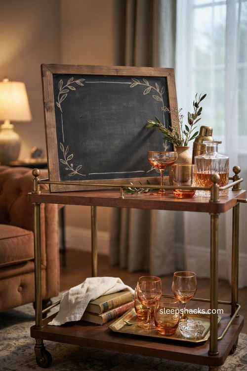
Borrow the look of a cocktail menu for a board that lives on the bar cart instead of the wall. Write “Fall” in narrow capitals and “Cheers” a little larger in script, using a liquid chalk marker so the edges stay crisp under lamp light. A strip of painter’s tape across the bottom gives you a straight baseline while you letter, then peel it away before adding a few small botanical outlines around the edge. Skip the pumpkins entirely here — a couple of amber glasses nearby does more to tie the season together than another illustration would. This is a good pick if your fall decorating tends to happen in the living room rather than the entryway or kitchen.
5. Golden Hour Sunset Board
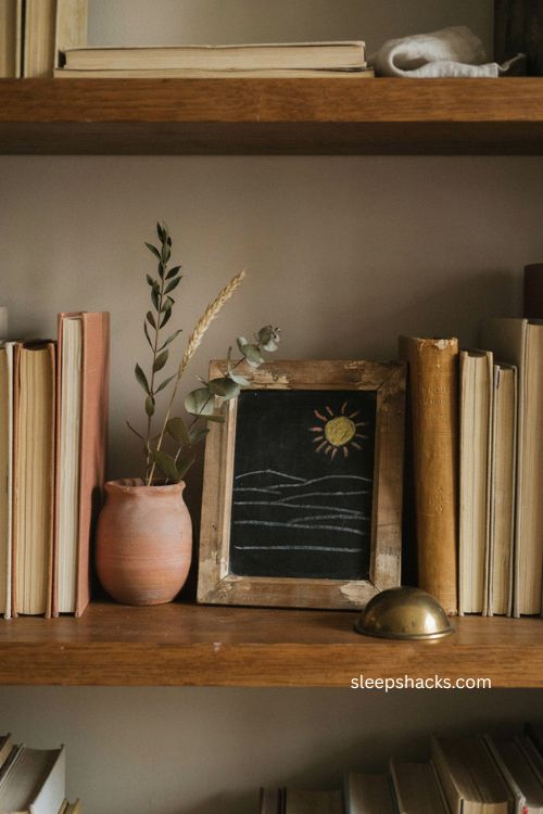
A low sun and a few thin horizontal lines can say “fall” just as clearly as a basket of leaves, and it fits a home office far better. Layer five or six fine chalk lines across the bottom half first, then add a small mustard-colored sun near one edge with soft terracotta rays reaching outward. Keep the lettering simple and white so it doesn’t compete with the color underneath it. This board earns its keep on a bookshelf rather than right next to your monitor, where a second rectangle would only add visual noise. One book with a mustard spine nearby is enough to connect the shelf to the board without turning the whole space into a themed display.
6. Autumn Apothecary Botanical Labels
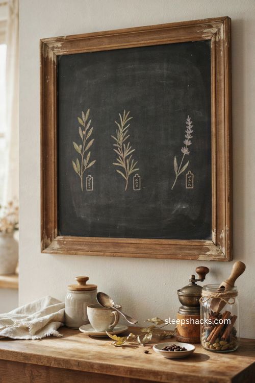
Instead of drawing full pumpkins or wreaths, sketch three or four delicate stems and label them the way an old apothecary jar might — “Cinnamon,” “Clove,” “Sage.” Keep the lines thin and a little irregular, since a perfectly neat botanical sketch tends to look stiff rather than hand-drawn. A liquid chalk marker with a narrow tip gives you the control these fine details need, though it’s worth testing on a hidden corner of the board first. Leave the center mostly open so the labels don’t crowd each other, and hang the finished piece above a coffee station where the ingredient theme actually makes sense. Muted olive works well as the single accent color running through the leaves.
7. First Frost Minimalist Branches
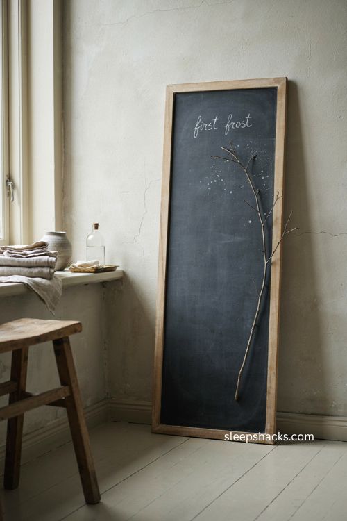
Some of the best fall boards skip color almost entirely. Draw a single branch traveling up one edge of a vertical board using a white chalk pencil, since its finer point gives you far more control than a standard stick of chalk. Add a scattering of soft dots around it with a cotton swab for a frosted look, and keep the words “First Frost” small and set high on the board rather than centered. This design works best somewhere quiet, like a bathroom vanity or a linen cabinet, where its restraint actually stands out. Resist the urge to add anything else — no pumpkins, no extra lettering — because the empty space around the branch is doing just as much work as the drawing itself.
8. Gather Here Dining Statement
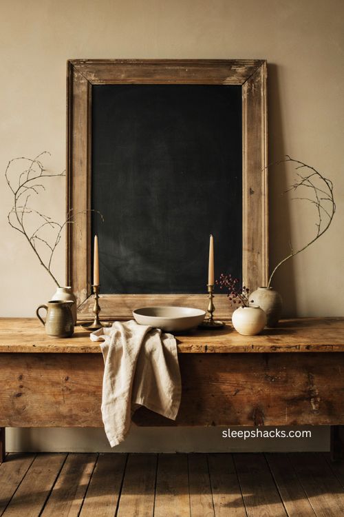
Big, confident lettering turns a common phrase like “Gather Here” into something that reads more like art than decor. Use a ruler to draw faint guidelines before you start lettering, then soften the pencil marks with a soft cloth once you’re happy with the spacing. Two simple branches framing the words are enough — skip the leaves, pumpkins, or extra flourishes that would compete with the size of the lettering itself. This idea needs a big board, at least 24 by 30 inches, to really work, and it belongs above a buffet or sideboard where a dining room already has some visual weight to match. One small pop of berry color is the only accent this design needs.
9. Quiet Harvest Abstract Vessels
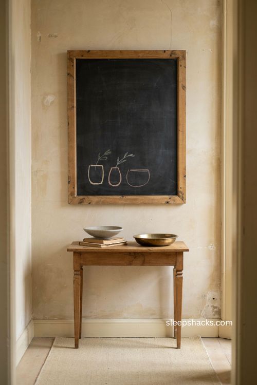
Three simple curved vessels, drawn as continuous outlines rather than realistic pumpkins or pitchers, can suggest a harvest without looking literal about it. Cluster them low on one side of the board and add just a few thin stems inside, using one warm color and one cooler gray so the palette stays balanced. Set the words “Quiet Harvest” above the cluster instead of centering everything, which gives the whole composition somewhere to breathe. This one works especially well in a hallway, a spot most people forget to decorate at all. A shallow bowl or a runner nearby in a matching neutral tone is enough to make the board feel connected to the space instead of standing apart from it.
10. Handwritten Autumn Supper Menu
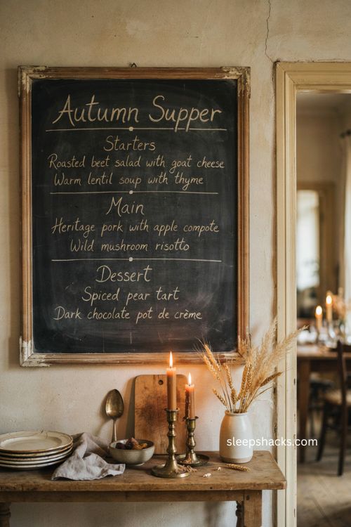
A chalkboard that actually does something tends to earn a permanent spot in the house, and a dinner menu is about as functional as fall decor gets. Head the board “Autumn Supper” in loose script, then list three courses underneath in small, neat capitals, using faint pencil guidelines to keep everything aligned before you commit to chalk. Separate each course with a tiny dot or a thin line rather than a full illustration, since a short, clean menu reads as intentional while a crowded one starts to look like a notice board. Traditional chalk is the practical choice if you plan to erase it after the meal. Set it near the dining room entrance so guests see it before they even sit down.
11. Harvest Moon Bedroom Accent
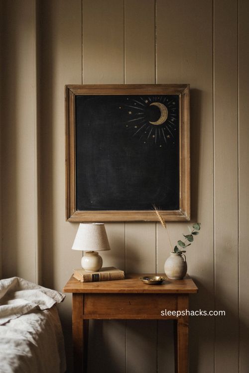
A small crescent moon tucked into the upper corner of a board brings fall into a bedroom without a single leaf or pumpkin in sight. Use a circular object as a template to get the curve right, then add a scatter of tiny stars in a muted gold and a few barely-there radiating lines in soft gray. Keep “Harvest Moon” in narrow lettering underneath, and leave most of the board bare so the design feels atmospheric rather than crowded. This one belongs above a nightstand, somewhere it can be seen without competing with the bed itself. Buffing the edges of the moon lightly with a dry cloth once it’s drawn gives it a soft, glowing look instead of a hard outline.
12. Thankful Notes Family Board
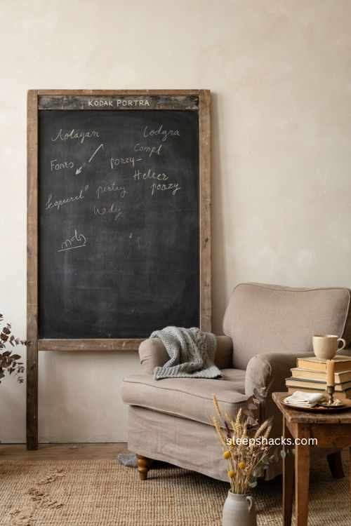
A gratitude board only works if it looks a little unfinished, so resist the urge to plan out every inch before you start. Write “Thankful For” across the top in clean lettering, then leave the rest of the space open for anyone in the house to add a note through November. Slightly uneven handwriting and mismatched spacing actually make this board feel more lived-in than a perfectly lettered one ever could. Keep a soft cloth nearby so notes can be erased and replaced without disturbing the heading above them. A spot near a reading chair or a side table works better than a formal wall, since this is a board people need to be able to reach.
13. Thanksgiving Countdown Tracker
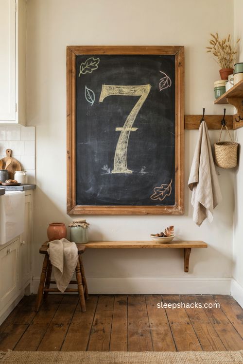
A simple number changes everything about how a chalkboard feels leading up to Thanksgiving. Write a large number at the center of the board along with a short line like “Days Until Thanksgiving,” then update the count each morning, which gives kids something small and exciting to check daily. Frame the number with a few simple leaf outlines instead of a full illustration, so the focus stays on the countdown rather than the decoration around it. This idea works best somewhere the whole family passes by often, like a kitchen or mudroom, rather than a formal dining space. Because the design changes daily, a liquid chalk marker isn’t necessary here — regular chalk erases far more easily for this kind of everyday use.
14. Cornucopia Harvest Drawing
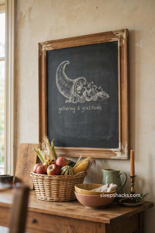
A cornucopia is one of the most recognizable fall images, and keeping the drawing simple is what keeps it from looking dated. Sketch a single curved horn shape with a handful of apples, corn, and gourds spilling out, using one warm color for the produce and leaving the horn itself in plain white or ivory chalk. A short fall quote above or below the drawing gives the board a little more personality without adding another illustration. This idea suits a kitchen or dining space where a more traditional harvest image feels at home rather than out of place. Keep the spilling produce loose and slightly overlapping rather than lined up neatly, since that’s what makes the drawing read as abundant instead of stiff.
15. DIY Painted Chalkboard Frame
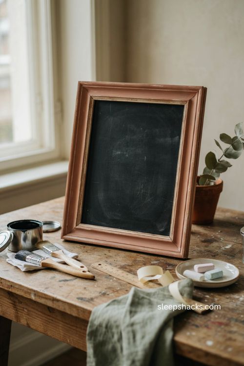
If you don’t already own a chalkboard, turning an old picture frame into one is a weekend project that costs very little. Remove the glass, apply two coats of chalkboard paint with a sponge for even coverage, and let it cure fully before drawing on it — rushing this step is the most common reason chalk art looks patchy later. Spray-paint the frame itself in a color that matches your room instead of leaving it in whatever finish it came in, since a mismatched frame can undercut an otherwise nice design. Condition the new surface by rubbing chalk over the entire board and wiping it off before your first real design. This is the idea to start with if every other one on this list requires a board you don’t have yet.
Final Thoughts
Pick one idea from this list and just start there — you don’t need to plan out every board in your house before you draw the first one. A chalkboard is one of the few decorations that lets you undo a mistake in seconds, so there’s very little to lose by trying a design that feels slightly ambitious. Sketch it in pencil first if you’re nervous about spacing, keep your color palette to one or two accents, and leave more empty space than feels natural at first. Once you see how easily a fall chalkboard idea slots into a room you already love, it gets a lot harder to stop at just one board this season.
Frequently Asked Questions
Q: What’s the easiest fall chalkboard idea for beginners? Simple block lettering paired with one or two leaf outlines is the easiest starting point, since even spacing matters more than drawing skill.
Q: Should I use chalk or chalk markers for fall chalkboard art? Traditional chalk works best for soft, changeable designs, while liquid chalk markers give you sharper, more defined lines for lettering-heavy boards.
Q: How do I keep chalkboard art from smudging? Keep the board away from direct contact, and if you want to preserve a design, photograph it before testing a compatible chalk fixative in an inconspicuous spot.